Kobana

Kobana brand guidelines

Strategy, verbal language and visual language to apply the Kobana brand consistently at every touchpoint.

Kobana vertical logo in lime green on a black background

01 — Purpose

Where everything starts

Every piece of text and every design at Kobana starts here. Purpose and key message are the filter for deciding whether a piece stands up or not.

Purpose

A financial platform connected to customer needs, supporting their digitalization journey.

Key message

“We take care of your processes, while you take care of your purpose.”

Brand architecture

Kobana is a monolithic brand: it lends its value to the products it offers through the same visual codes and the same name, creating consistency and strength. The tone adjusts to the audience; the identity never changes.

Small and medium businesses

Closer communication. Emphasis on value for money, security and support.

Large enterprises

More technical communication. Emphasis on security and API coverage.

02 — Design principles

Three guidelines behind every creation

The principles translate the strategy and guide every expression of the brand, whether verbal, visual or sensory.

Democratic expert

Kobana is simple without being simplistic.

We are experts who make things easier. With intelligence and clarity, we turn subjects that could seem complex into content that is simple, accessible and interesting for everyone. After all, only someone who truly understands a subject can explain it in the simplest possible way.

Attributes

  • Expert
  • Enabler
  • Connects knowledge to each customer's needs

Humanized customization

Kobana is serious without being stern.

A brand that understands the needs of whoever comes to it, and that will do everything to make the solution fit that customer. We care about listening and about putting the customer at the center of product development. We make it clear that the connection is P2P (people to people), not B2B.

Attributes

  • Human
  • Close
  • Flexible
  • Adaptable

Empowering technology

Kobana simplifies in order to transform.

Innovation designed to empower people and their goals. Technology that lets customers lose less time, ease processes and focus their energy on their own purpose. It is not enough to say the technology is robust: we translate what the daily benefits are for the customer.

Attributes

  • Robust platform
  • Secure
  • Fast

03 — Verbal language

Clarity that widens horizons

The days when speaking in complicated terms signalled knowledge are long gone. Today, being objective matters more than being complex: making sure something is understood in full without spending much time on it — and without taking up anyone else's time.

The tone of voice applies to every touchpoint: from a social post to a phone call, from an ad to an internal announcement. It exists to widen the options of whoever is writing, never to box them in.

Clearly uncomplicated

Kobana knows what it is talking about (and knows that it knows, you follow?). That is why it is not afraid to speak clearly, without detours. Only someone certain they understand a subject well can strip every unnecessary piece of information out of what they say.

How we speak

We keep an expert tone
We are clear, but we make a point of demonstrating robustness, experience and credibility through practical examples and proven solutions.
We put technology to work for us
If the content is easy to understand, we carry on. If anything could be misread, we explain it and even translate it. We prefer plain wording whenever an equivalent exists.
We untie every knot
We prefer text that uses conjunctions and connectors to create flow. Shorter, well-measured sentences make understanding easier.

How we do not speak

We are not over the top
We avoid superlatives and absolutes such as “the best”, “the biggest”, “an amazing solution” — unless we prove it right afterwards.
We do not create distance
We explain acronyms, jargon and foreign words so that no distance opens up between us and our audiences.
We do not claim to solve everything
We never promise beyond what we can deliver, and we never say “here you will find the solution to all your problems”.


Humanly accessible

When we know what our customers are looking for and listen to their expectations, we create more than a way of communicating: we create a way of having a conversation. That is how we bring in our human, accessible and welcoming side.

How we speak

We start good conversations
We leave room for a reply: we ask questions, ask for opinions and invite the reader in. We refer to ourselves as “we” rather than “Kobana”.
We build relationships
We look for long-term relationships, because bonds are not formed when a service is signed but in how we connect from first contact through to post-sales.
We show we move fast
Our language carries signals of our commitment to efficiency: “Of course!”, “On it”, “Consider it done”.

How we do not speak

We do not ramble
We start good conversations without losing focus. Nobody should go through a dozen steps before reaching what they need.
We do not invade anyone's space
Being close does not mean flooding customers with messages or filling their inbox with unnecessary interactions.
We are not rushed
Information is never left half-finished: we give fast and complete answers, so the customer gains time, not more doubts.

Particularly friendly

Close, relaxed language goes beyond picking the right words: it carries our way of being and doing as a brand. That is why the way we speak should always be friendly, light and transparent.

How we speak

We value informality
We set corporate speak aside. “Do” beats “execute”. “Solve” is simpler than “elucidate”. And “you” works just as well as any formal address.
We make the message personal
We are broad without being generic. Each customer is unique and each conversation is a chance to build a relationship. Whenever possible, we use people's names.
We treat everyone as equals
Large or small business, huge demand or a one-off job, we show the same friendly and close attitude.

How we do not speak

We do not force closeness
Writing in a close way does not mean treating the reader with exaggerated familiarity. When solving problems, the focus is as much on delivery as on warmth.
We do not underestimate our reader
We shorten the path between our message and understanding, but we know how to gauge what genuinely deserves a deeper explanation.
We do not overdo it
We bring lightness, but we avoid slang, niche expressions and jokes that try too hard. We would rather lose the punchline than lose the message.

In practice

“Hi, we are Kobana. And we are here to show that managing receivables does not have to be a bureaucratic subject. Want to see? We are a robust financial platform focused on building practical, secure and efficient solutions to strip the bureaucracy out of the financial system. Because time well spent is the time you can put into what really matters: your business.”

05 — Symbol

Kobana's K

The symbol is the letter K from the logo, on its own. It exists for spaces where the full logo would not fit legibly: app icons, favicons, social avatars and authentication buttons.

Lime green plate

Default version. Use for app icons, favicons and buttons.

SVG

Black plate

Alternative for compositions already dominated by lime green.

SVG

Black

Symbol with no plate, for use on light surfaces.

SVG

White

Symbol with no plate, for use on dark surfaces.

SVG

Lime green

Symbol with no plate, for use on a black background.

SVG

When to use the symbol

  • • App icons, favicons and shortcuts
  • • Avatars on social networks and profiles
  • • Authentication and integration buttons
  • • Square spaces smaller than 100 px

When not to use it

  • • As a replacement for the logo in corporate materials
  • • Next to the full logo in the same composition
  • • Redrawn, cropped or with an altered stroke
  • • In colors other than black, white and lime green

Integrating sign-in with Kobana?

The "Sign in with Kobana" button has its own specifications for color, spacing, typography and wording. Check the guidelines before you ship.

See guidelines

06 — Visual language

Typography, colors and supporting elements

The visual language turns the design principles into concrete, reusable elements.

Typography

Work Sans

Primary

A simple, low-contrast design that does not steal attention from the content. A broad and versatile family, it can be used in headings, body copy and across every touchpoint.

Available weights

  • Thin
  • Extra Light
  • Light
  • Regular
  • Medium
  • Semi Bold
  • Bold
  • Extra Bold
  • Black

Every weight also has its italic version.

Syne

Secondary

A display face with a lot of personality, to be used responsibly. Overusing it, or setting long text in it, hurts comprehension of the message.

Where to apply it

Headings and standout numbers. Applied strategically, Syne takes on a welcome leading role. Avoid it in body copy.

Colors

Kobana's colors were chosen with a close eye on the fintech market and on their meanings. Together, they reflect the design attributes of the brand.

Primary colors

Lime green and black should always be the dominant colors.

Lime green

Money, growth and sustainability

RGB
R211 G253 B84
CMYK
C27 M0 Y80 K0

Black

Elegance, trust and innovation

RGB
R0 G0 B0
CMYK
C0 M0 Y0 K100

Secondary colors

They appear in details, never as the dominant color of a composition.

Purple

Wisdom, creativity and passion

RGB
R166 G48 B218
CMYK
C60 M80 Y0 K0

Gray

Technology, professionalism and solidity

RGB
R103 G103 B103
CMYK
C56 M45 Y45 K32

White

Transparency, infinite possibilities and balance

RGB
R253 G253 B251
CMYK
C0 M0 Y0 K0

Kobana universe

As the language unfolds, we can choose chromatic proportions that make sense for a subject or an audience, as a way of differentiating — always keeping lime green and black as the primary colors.

Supporting elements

Photography

Photography should convey closeness, trust and the expertise of someone who knows the subject. Explore the customer's everyday life, the focused attention of the team, partnerships and relaxed moments — as well as serious ones.

  • • Black and white images reinforce brand recall
  • • Tight framing puts the focus on what actually matters
  • • Diversity is welcome: every audience should feel represented
  • • Processing: first adjust to black and white, then balance light and shadow in the contrast

Patterns

By repeating the lines that build the letters of the brand, we create the patterns that make up Kobana's graphic layer.

  • • Line weight: 1 px
  • • Use as a supporting texture, never competing with the content

Icons

We use the Streamline icon family, which has a broad interface repertoire. Its language is flat, outlined and quick to read.

  • • Flat and outlined style
  • • Consistent stroke across every icon
  • • Immediate understanding before any decorative detail

Illustrations

Illustrations should be geometric and fluid: geometric to acknowledge precision and technique, fluid to counterbalance the human and flexible side of the brand.

  • • Flat, clean and without frills
  • • Objective and democratic communication
  • • Palette restricted to the brand colors

07 — Illustrated brand

Animals that tell the brand

The illustrated brand is a layer of expression that complements the branding: it creates visual memory, strengthens brand recall and brings Kobana closer to each audience. These are illustrations in an animaloid style, mixing machine — technology and geometry — with animal — human and fluid — to convey the idea of banking operations on autopilot.

Robust

Something that has strength, with a very strong and resistant physical structure. Tied to the idea of technology built with technical precision, of a secure platform.

Modern

A sense of the present and of current themes that matter for human development — environmental sustainability, the climate crisis, technology — everything that secures quality of life for the next generations.

Handcrafted

Something that belongs somewhere and defines a place or region. Personalized for something specific and unique, representing a direct connection with someone.

Why Brazilian fauna

Animals play a fundamental role in the balance of the environment. Protecting, representing and spreading images of local animals supports education and connects the brand to each biome. That lets us create collectible illustrations, chosen according to the audience and the region of the event — the Amazon, the jaguar; Curitiba, the azure jay — always representing the attribute of robustness without losing agility.

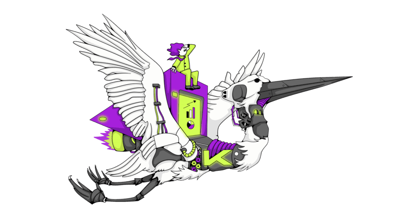
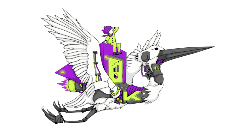
Kobana illustrated brand — Maguari stork

Maguari

Stork — from Tupi, “strong beak”

Found across much of South America: in Rio Grande do Sul, the Amazon, the Northeast and the Pantanal. It measures up to 1.4 metres and has a 2-metre wingspan.

It represents good omens, fertility and growth. In the East it is a symbol of immortality and longevity. It can also be read as symbolism for contemplation and concentration.

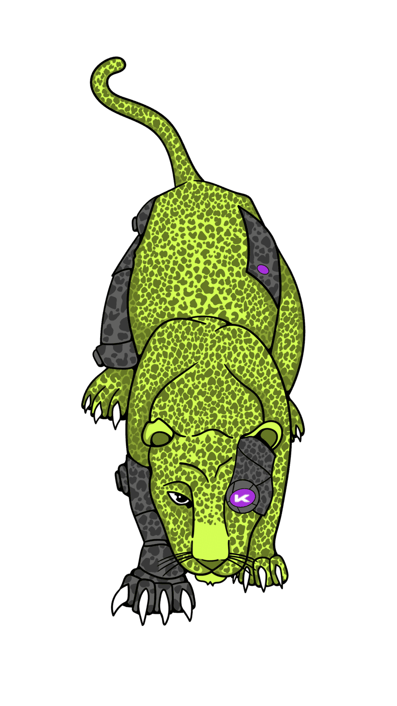
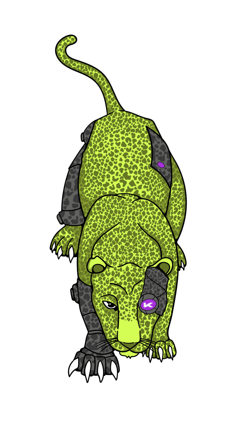
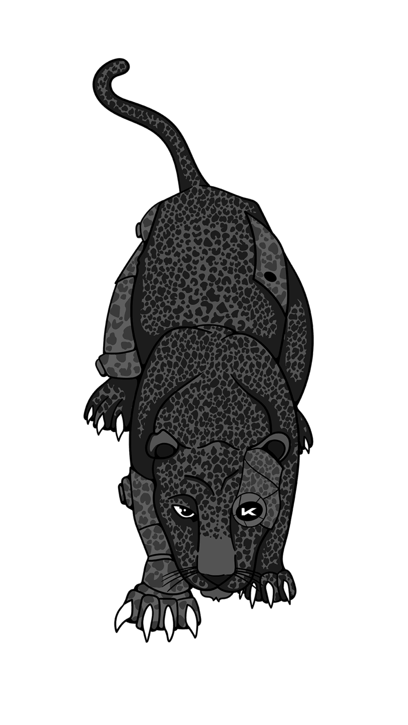
Kobana illustrated brand — jaguar

Jaguar

From Tupi, jaguar

The largest feline on the American continent, reaching up to 135 kg. A robust animal with great muscular strength and the most powerful bite of any cat in the world. Sitting at the top of the food chain and needing large preserved areas, it is an indicator of environmental quality.

Revered across different cultures and traditions, it symbolizes strength, courage, power, leadership, protection and wisdom.

How to apply

  • • At events, on sites, channels, merchandise and stationery
  • • As a supporting layer, always alongside the logo
  • • With the 1 px line pattern to reinforce speed and connection
  • • In the black and white version when the piece is single-color

What to avoid

  • • Using the illustration in place of the logo
  • • Combining two illustrations in the same piece
  • • Recoloring, cropping or redrawing the illustrations
  • • Treating the illustrations as characters with a name, voice or personality

08 — Third-party use

Press, partners and integrations

If you are not part of the Kobana team and you are going to use our brand in an article, a partnership piece or an integrated product, follow these rules.

Do

  • • Use the official files on this page, unaltered
  • • Keep the logo's original proportions
  • • Respect the 2X clear space
  • • Use only black, white or lime green
  • • Apply over backgrounds that guarantee contrast
  • • Write the name as Kobana, with a capital K and the rest lowercase

Do not

  • • Distort, rotate or crop the logo
  • • Change colors, proportions or spacing
  • • Add shadows, gradients or outlines
  • • Scale below the established minimum size
  • • Use the brand in a way that suggests a partnership, sponsorship or endorsement that does not exist
  • • Incorporate the brand into your product's name, logo or domain

Questions about brand use or requests for extra material: imprensa@kobana.com.br. See also the press room.

09 — Downloads

Brand files

Every official file you need to apply the Kobana brand.

Brand pack

Logo in PNG and AI, the K symbol in SVG and the illustrated brand in PNG.

Download

Full brand book

PDF covering strategy, design principles, verbal and visual language.

Download

Logo kit

Historical logo package in different formats and versions.

Download

Illustrated brand

Source files for the stork and the jaguar in AI, PDF, PNG and JPEG, with applications.

Download

Need something that is not here?

Talk to us if you need a specific format, approval for a particular use, or material tailored to your publication.